Worsening Housing Affordability across the UK
This map was made for one of my modules on Cartography and Data Visualisation. We were tasked to create a map that shows social inequality in the UK and I chose to map how housing affordability worsened in an uneven manner across different regions in the UK.
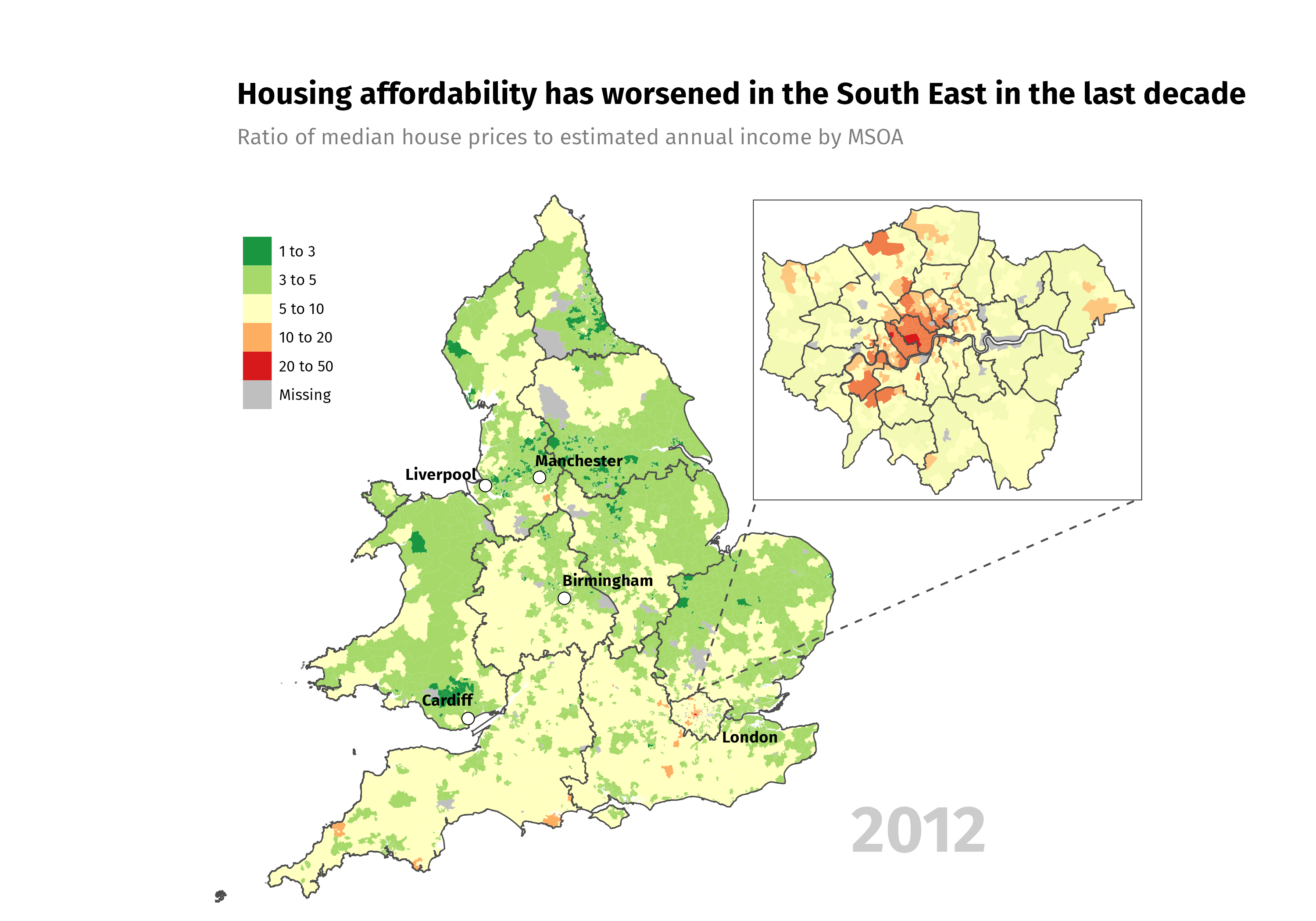
The map supports the notion that it has become increasingly difficult to purchase a house. The ratio of median house prices to annual income estimates can be roughly interpreted as the number of years it would take to save up for a house in the area, assuming that none of the income is spent. We see that housing affordability has worsened across the UK, but more intensely so in the South East and especially in London. This echoes ongoing conversations about the housing affordability crisis, particularly in London where housing prices are said to be spiralling out of control.
This visualisation was created using data on annual household income estimates for small areas (MSOAs) and median house prices by MSOAs provided by the Office for National Statistics.